Role
Lead UX Designer
Scope
Device UI
Web Config
Device Config
Graphics

Challenge
Xerox MFDs had a discoverability problem. Critical actions were buried too deep for the shared, high-traffic environments they are designed for.
A BLI industry report confirmed that settings discoverability was a recognized pain point across the industry, as Canon, HP, and Toshiba had nothing comparable.
Solution
I designed the Quick Access feature to configure device actions and make them easier to access. The experience was crafted across multiple platforms so shortcuts could be selected, managed, and used conveniently.
Experience Layers
Four layers across the device and its management infrastructure. Each served a different user at a different point in the workflow.
Collaborated with:

Product

Engineering

Graphics
Strategy
The solution space was already crowded with opinions. My job was to find what was actually buildable, user-friendly, and worth shipping.

Reframe the problem
The solution had to live within the existing LUI structure without disrupting it. I guided the scope from "we need a new global info panel" to "users just need faster access to important actions without digging."

Evaluate LOE honestly
Factor in hardware constraints (smaller models with limited capability vs. large production screens), developer familiarity with newer design system patterns, migration timing, and the risks of introducing new animation or graphics loads on legacy hardware.

Find the right compromise
A visible tab and a floating button were both explored and ruled out. A swipe-down panel introduced a separate problem. Users would have no way to discover it without being told it existed. A single expandable Quick Access Button solved that. It could live within the existing system, honor legacy design structure, and stay visible enough to work without instructions.
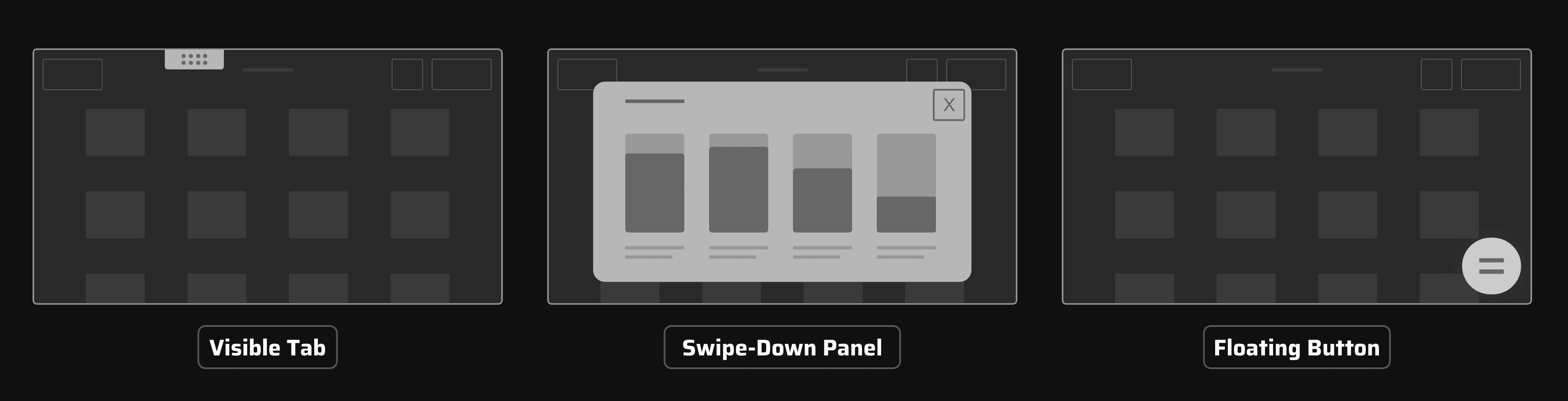
Experience Ecosystem

Device interface
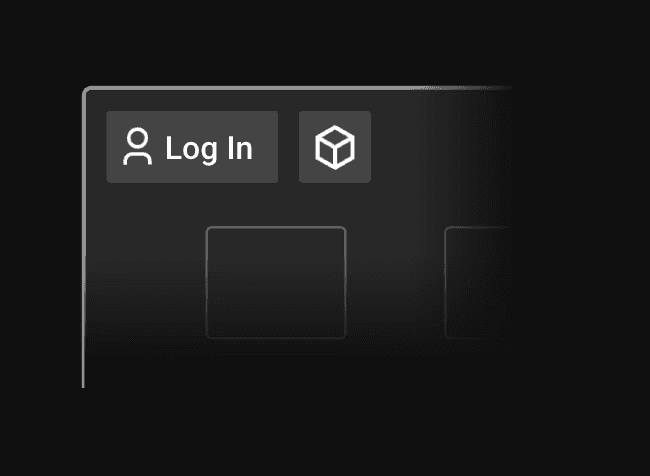
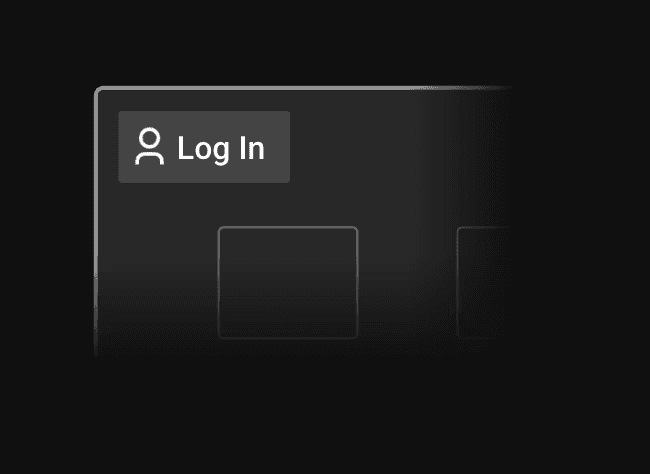
Three configuration states each required distinct behavior: multiple actions expanded a menu on tap, a single action navigated directly, and no actions configured removed the button entirely. No empty states, no placeholders. The design stayed invisible when there was nothing to show.
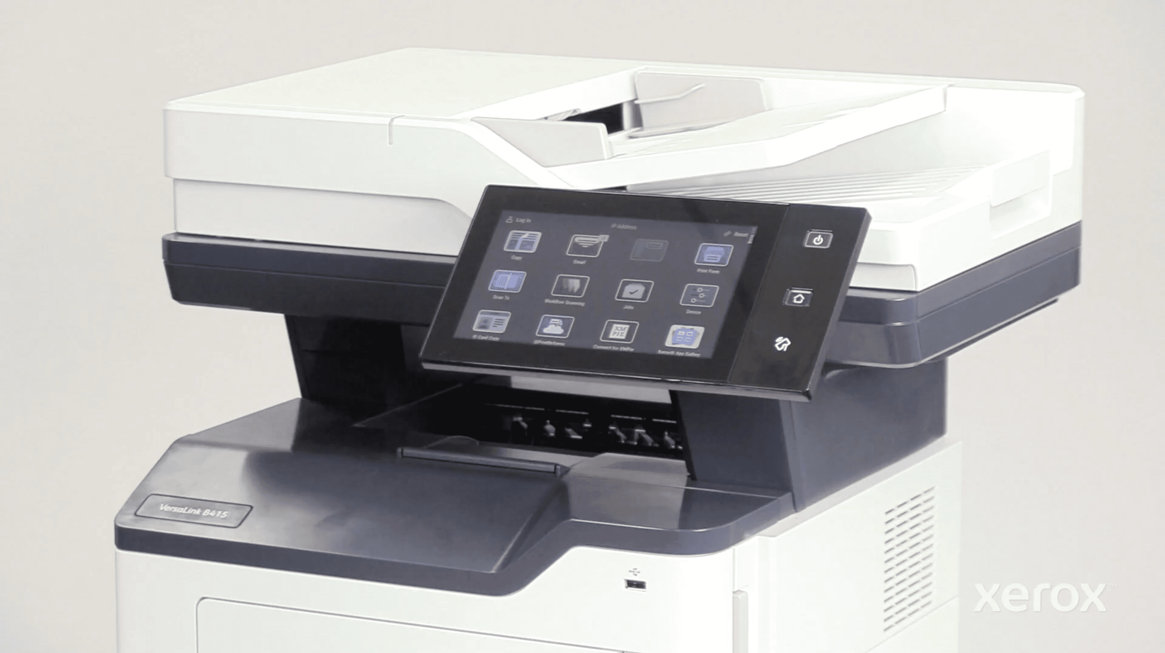
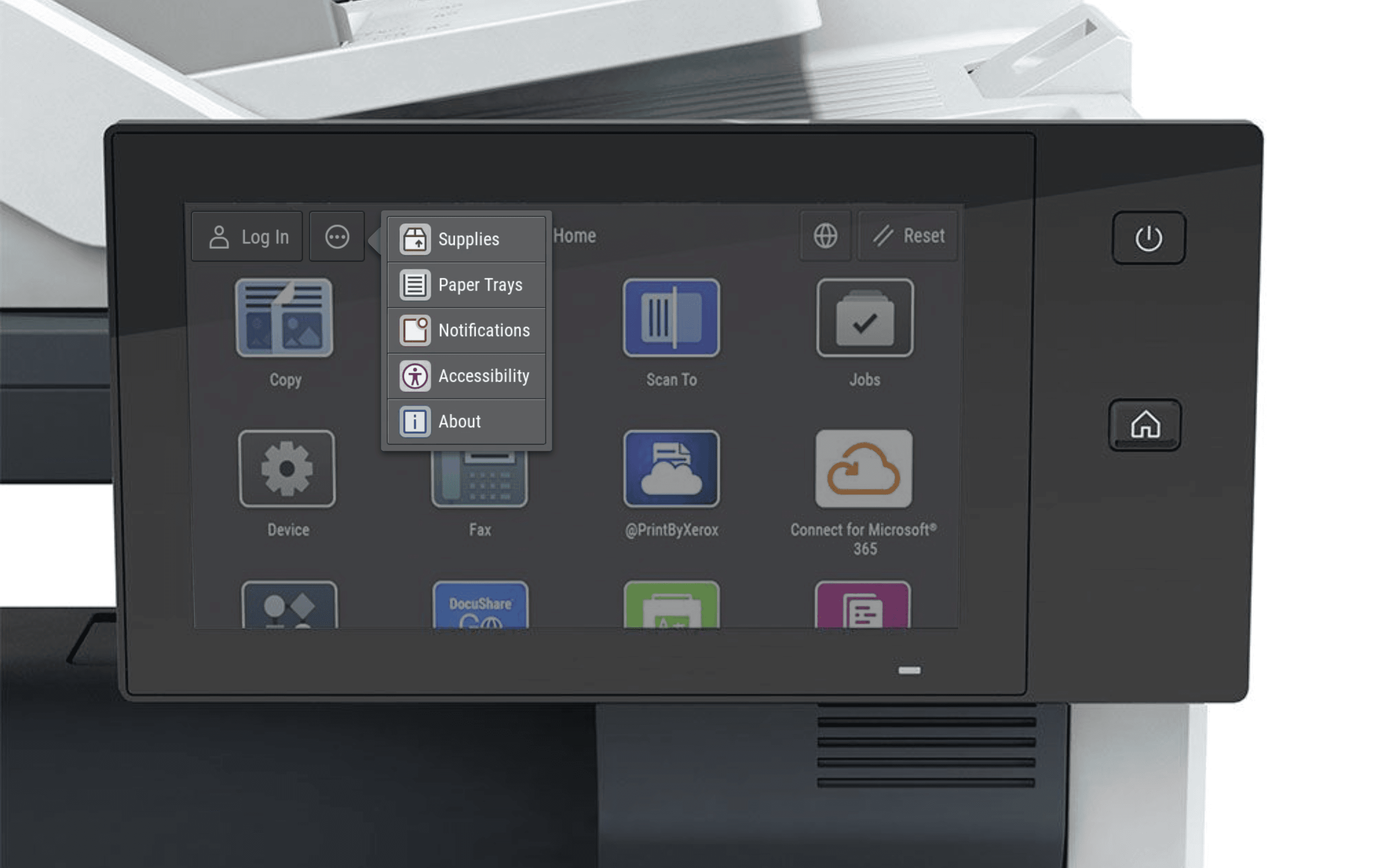
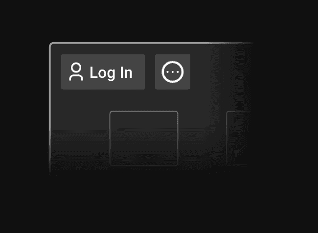
[a] Multiple Actions Configured
Button shows the Quick Access icon. Tap expands the full menu.
[b] One Specific Action Configured
Button shows that action's icon only. No menu. Tapping navigates immediately.
[c] No Actions Configured
Button disappears from the action bar entirely. No empty state, no placeholder.

Device configuration workflow
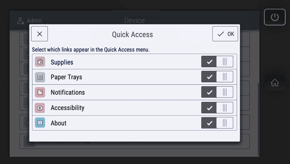
On-device setup had to work within the existing Tools settings flow. Introducing a new pattern would have created design system conflicts across a mixed-generation product line and added developer overhead. The configuration workflow fit into what was already there instead of building around it.

Web configuration portal
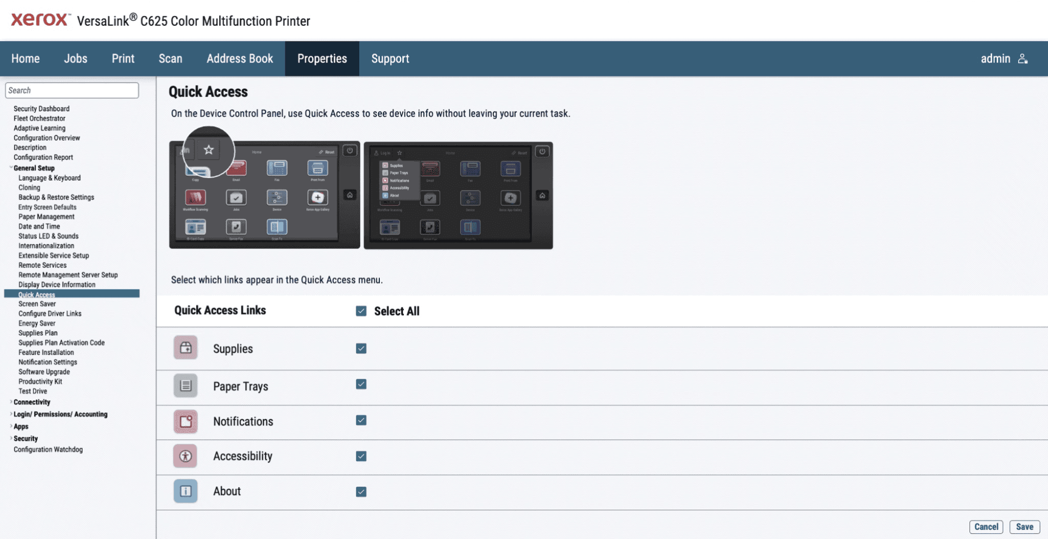
Enterprise devices are managed remotely. Admins needed a way to configure Quick Access without physically accessing each machine. The web portal gave IT that control so shortcut behavior could be set and updated across entire device fleets from one place.
Explanatory graphics
Quick Access introduced behavior users had not seen before on these devices. Graphics explained how the button worked, what tapping it did, and how configuration choices connected to what appeared on screen.
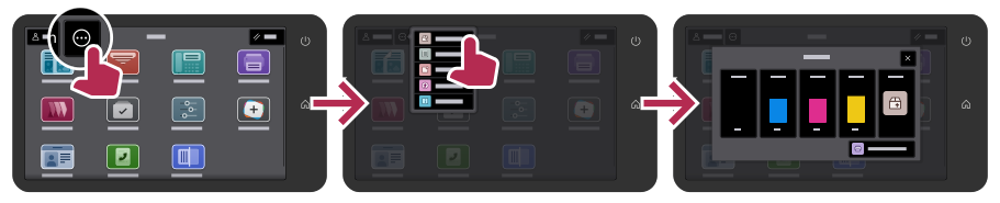

Complete User Journey

Validation
Design assumptions were tested through developer collaboration, live hardware testing across the full lineup, and a structured usability evaluation with real users through Xerox's internal research team.
Outcome
30-50%
Reduction in task time
500K–1M+ Users
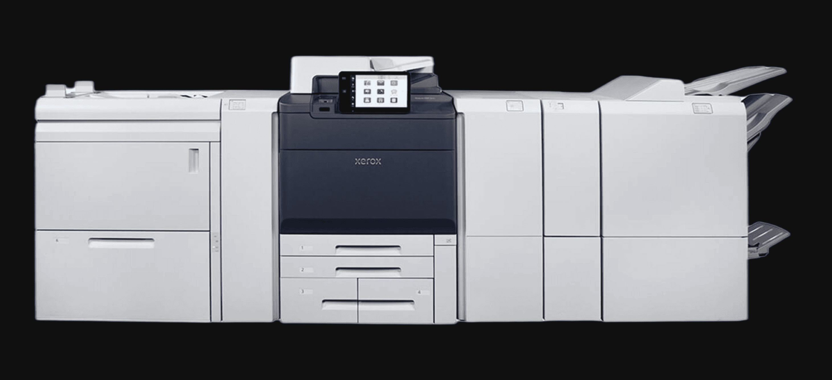
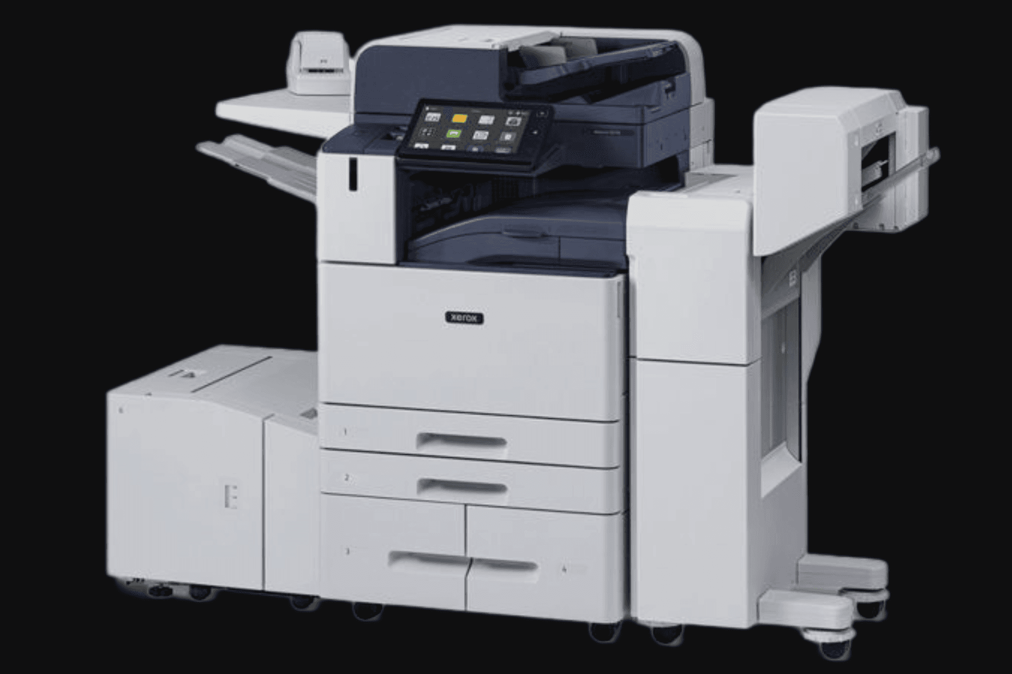
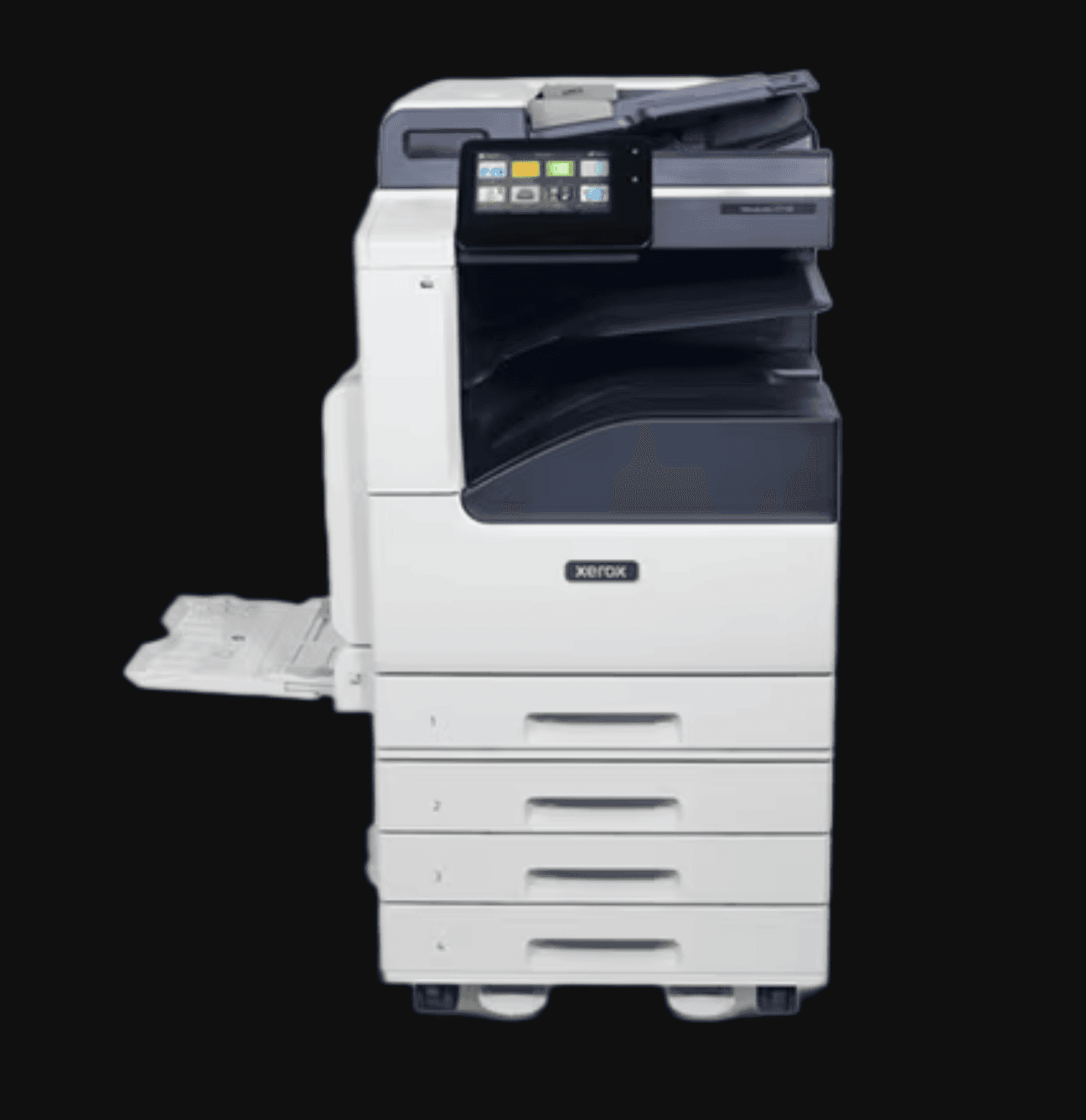
Shipped across full device lineup globally
Zero Regressions
No disruption to existing architecture
The Quick Access Button shipped across the full Xerox device lineup without disrupting existing architecture. The design also laid the groundwork for a context-adaptive guidance system the team could build on after release.